
Visualizing workload through charts and diagrams will help you see the big picture of your task performance. Workload is the amount of tasks and jobs that you are assigned to and that you need to complete over a certain period. Various graphs let create visualization of how you perform your activities and what workload you must cope with. Some of the most popular graphs for workload and performance visualization are Pie chart and Burn-down diagram.
Pie chart presents workload as a series of segments or sectors that show percentage of every task assigned to you. The benefit of Pie chart is that it helps easily compare the segments to each other. You gain a visual picture of what segments are larger/smaller and hence what tasks require more/less time and effort. Besides, Pie chart provides task analytics data that tells you whether you need to increase your performance and what next tasks you must focus on.
Burn-down diagram displays workload in terms of tasks remaining for completion. This diagram lets you determine whether you hit your deadline and what amount of work you must do to reach this deadline. Burn-down chart is convenient for measuring work progress, tracking current performance, and forecasting future performance. The progress line on the diagram tells you if you perform tasks on schedule and if you need to speed up your performance.
|
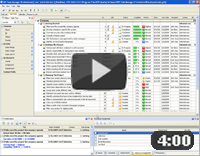
CentriQS Task Analytics Solution CentriQS provides users with Task Analytics OLAP cube that allows analyzing employee performance, project progress and other parameters from multiple perspectives. Users can work with Pivot tables to group analytical data, visualize it on charts of various types or gather Pivot table and most frequently used charts on one dashboard. |
|